DESIGN BRIEF
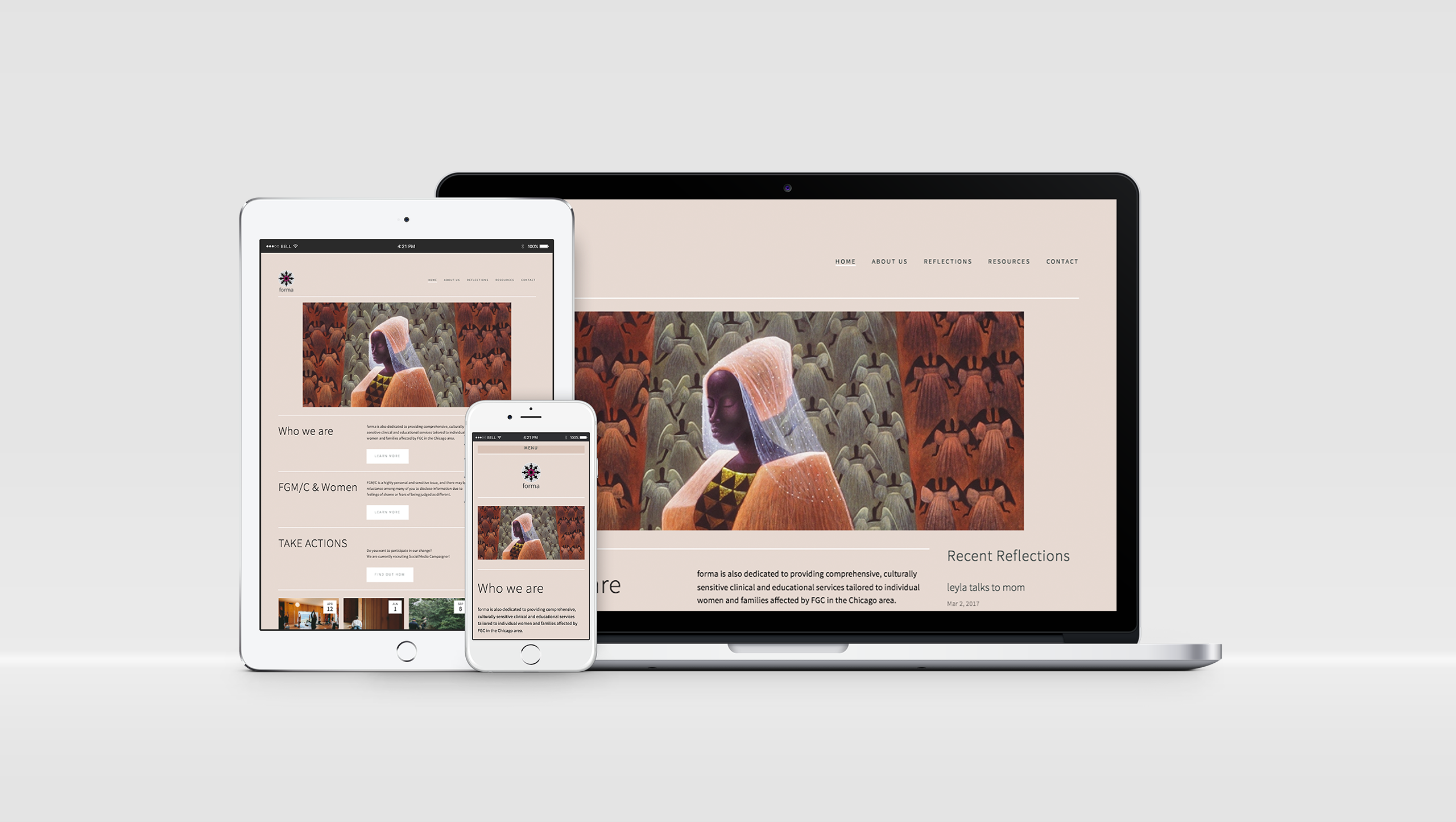
Responsive webdesign (Mobile, Tablet and Desktop view)
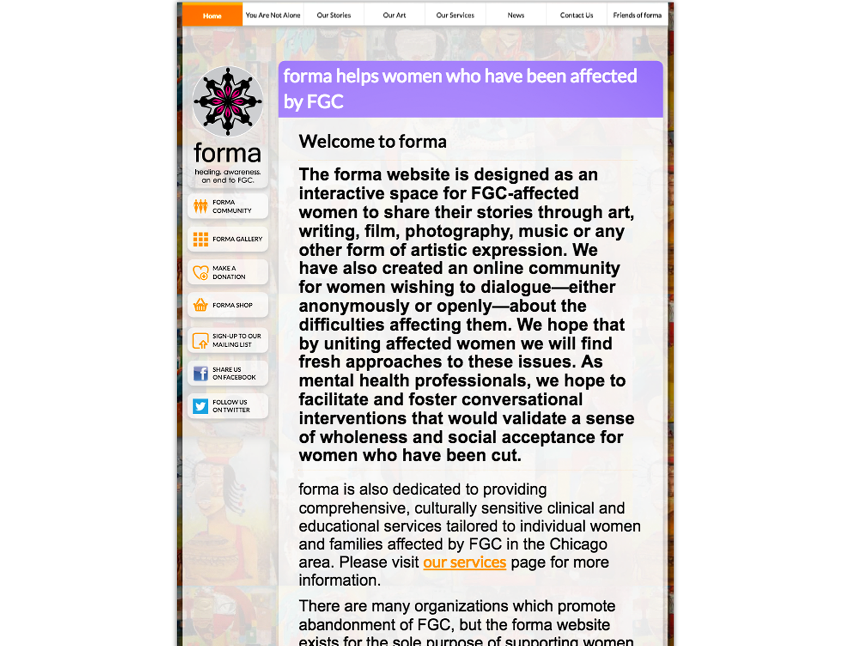
Before
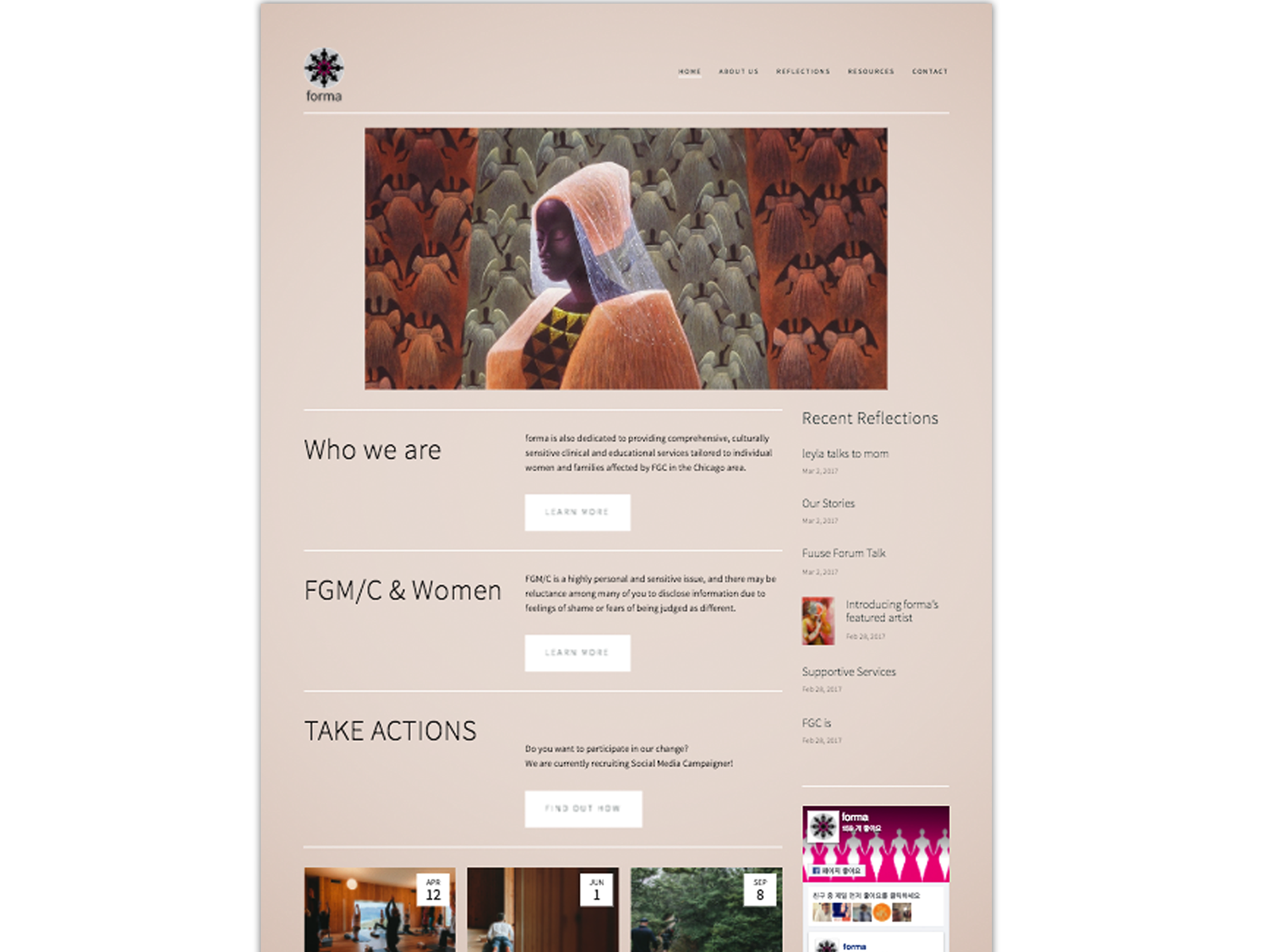
After
DESIGN PROCESS
01. Framing the Problem
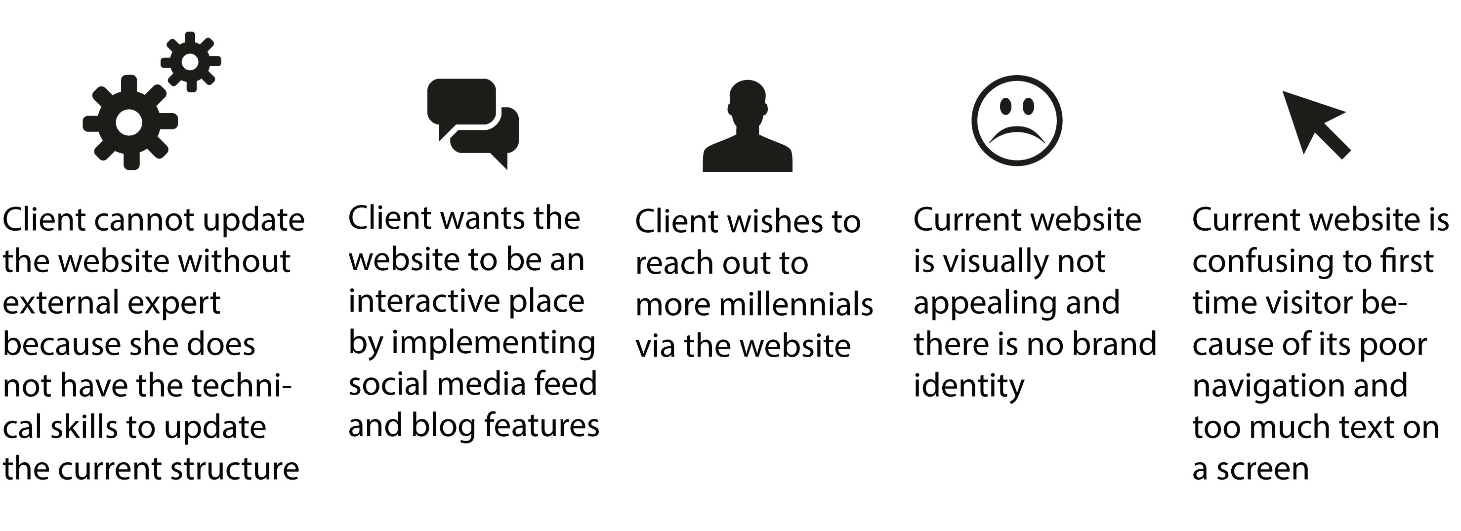
Find the client’s needs and analyze the current website
During the meeting with our client, we made an effort to understand our client’s goal of redesigning the organization’s website. In this stage, we learned about the target audience of the website and the purpose of the website. With this meeting, we also explored and analyzed the existing website to find what problems the website had. I finally framed the problem of the project as following:
Comparative Analysis
In order to get familiar with website style of other non-profit organizations and to get design ideas, we analyzed other non-profit organization websites. Through this comparative analysis, we got a better idea about common styles and trends of non-profit organization websites. For example, many organizations use photographs wisely at their first page to grab user’s attention, websites show organizations’ current activities on their first page, and they have a page that introduces the organization. However, those were not part of our client’s existing website.
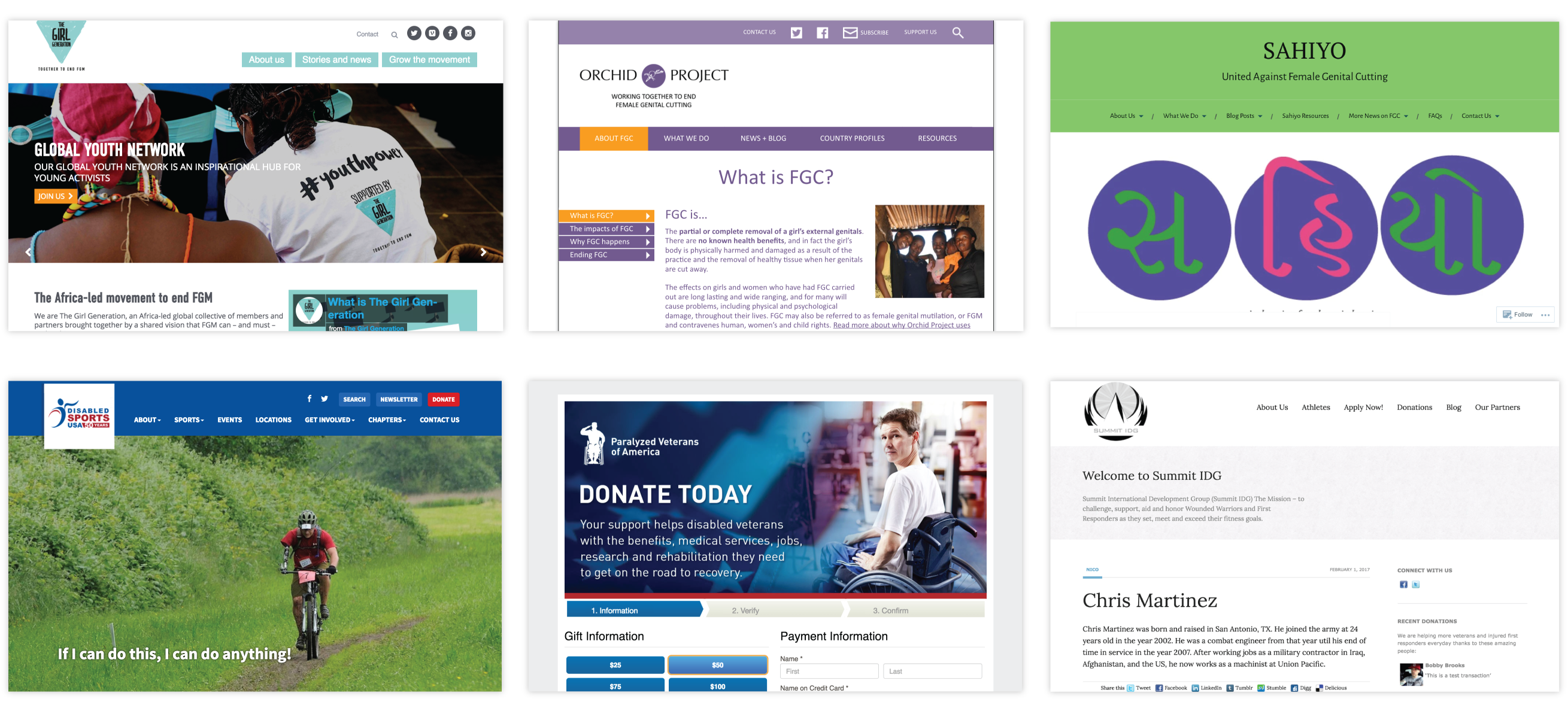
Reference: Other non-profit organizations websites
02. DESIGNING WEBSITE
Information Architecture
We used card sorting to improve the information architecture. From the perspective of a new visitor, we made navigation easy. For easy navigation, we reduced the number of navigation tabs. Contents were also re-organized under the same topic. Finally, we made labels that use top-of-mind phrases for visitors.
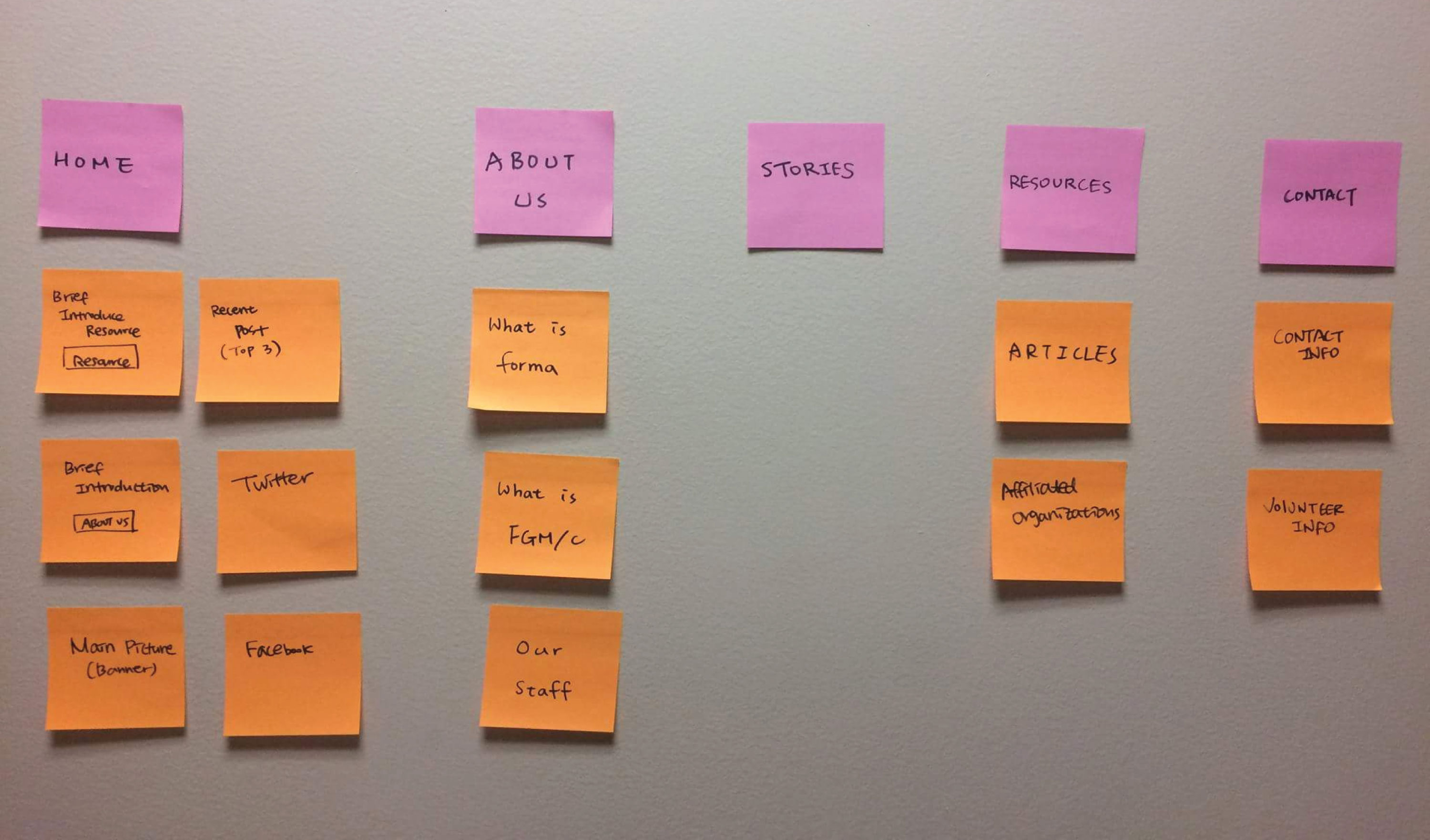
Card sorting using sticky notes
Sketch & Wireframe
Based on new information architecture, I sketched a layout of new website frame and I designed a wireframe before we jumped into building the website. The redesigned version of the website has a new navigation tree.
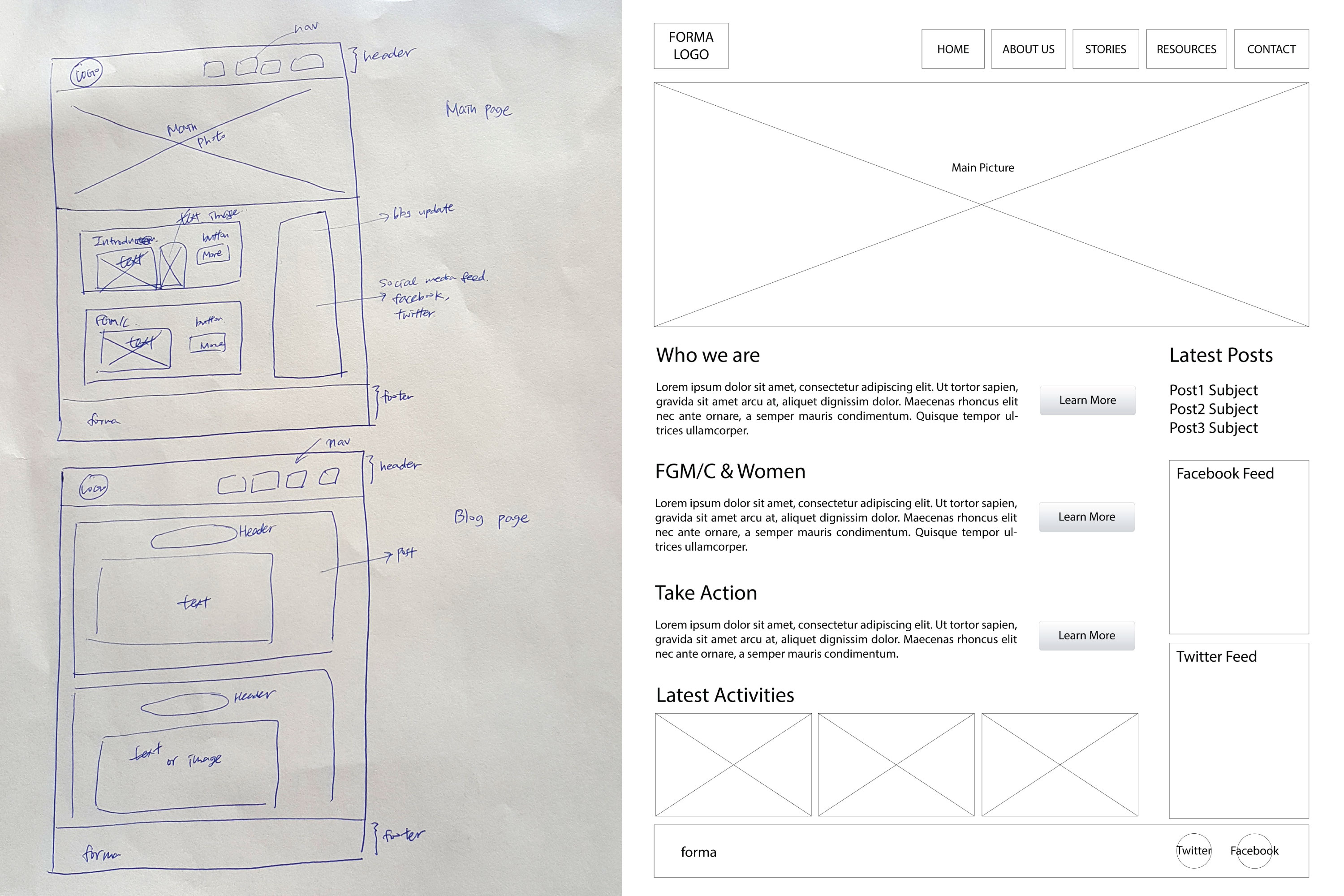
Initial sketch and wireframe (Adobe Illustrator)
03. Building the Website
Building Website with CMS
Our client wanted us to build a website using a CMS, so that she can manage the contents without external support. We tried to build a Wordpress site at first, but we decided to use Squarespace because it has less of a learning curve due to its intuitive user interface. Then, we looked for the best templates that could implement our wireframe. We moved some contents from the previous site to new site according to information architecture.
Deciding design component
After setting the template and inputting some contents, we discussed key design components of the website: color, typography and the main picture. The client wanted to give a healing and peaceful feeling with this website to someone who has had a traumatic experience, and she also wants the website to welcome various audiences. Considering those client’s needs, we use colors that are warm (e.g., red, orange) and neutral. In addition, we decided to use a sans-serif typeface for a simple look. Although we knew well about the importance of the main picture on the first page, it was hard to find the right picture because FGM/C could be a sensitive topic. If we use misuse the photo, it could look too light or too serious. For this reason, the client decided not to use a photo for the main picture.
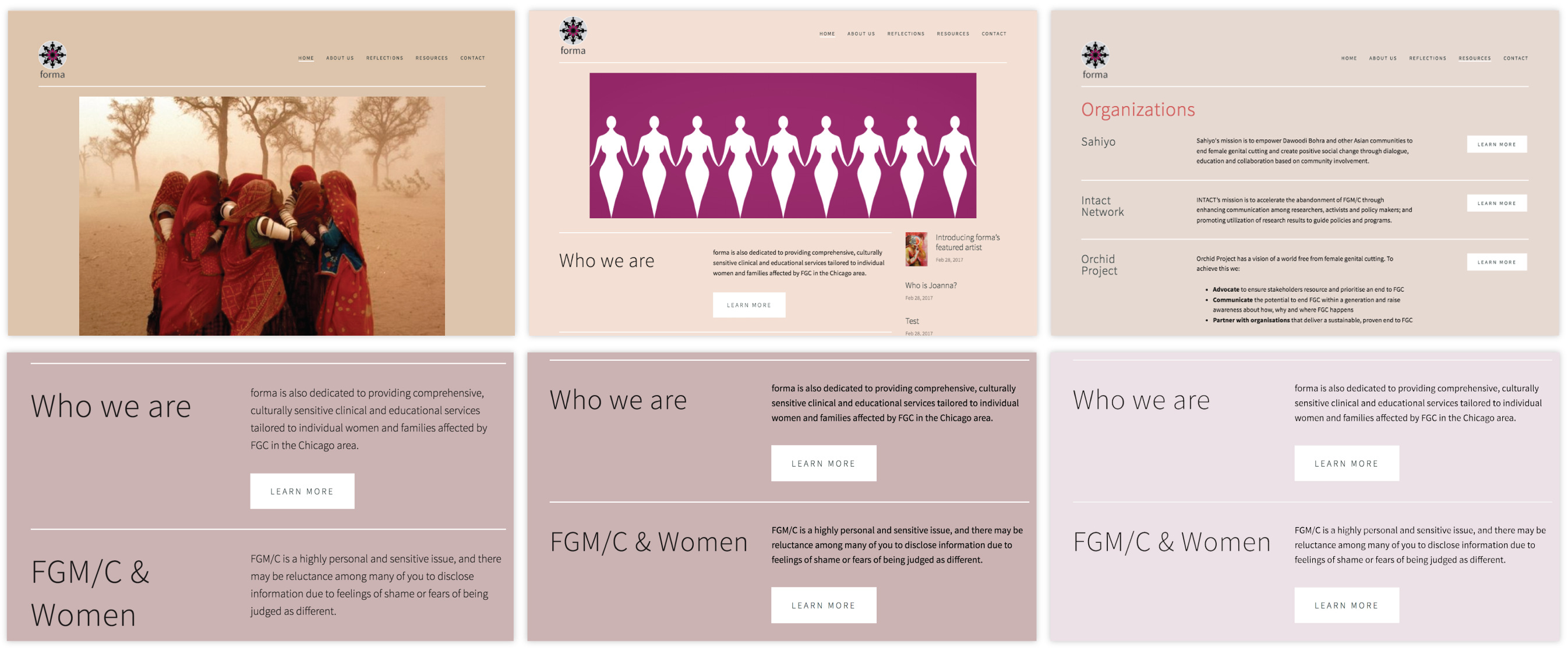
Sample of design component decision
Creating guideline documentation for the client
Finally, we documented a guideline for the client. The document consisted of screenshots and annotations for easy to follow. We handed in this document while we let her know about Squarespace functions step by step.
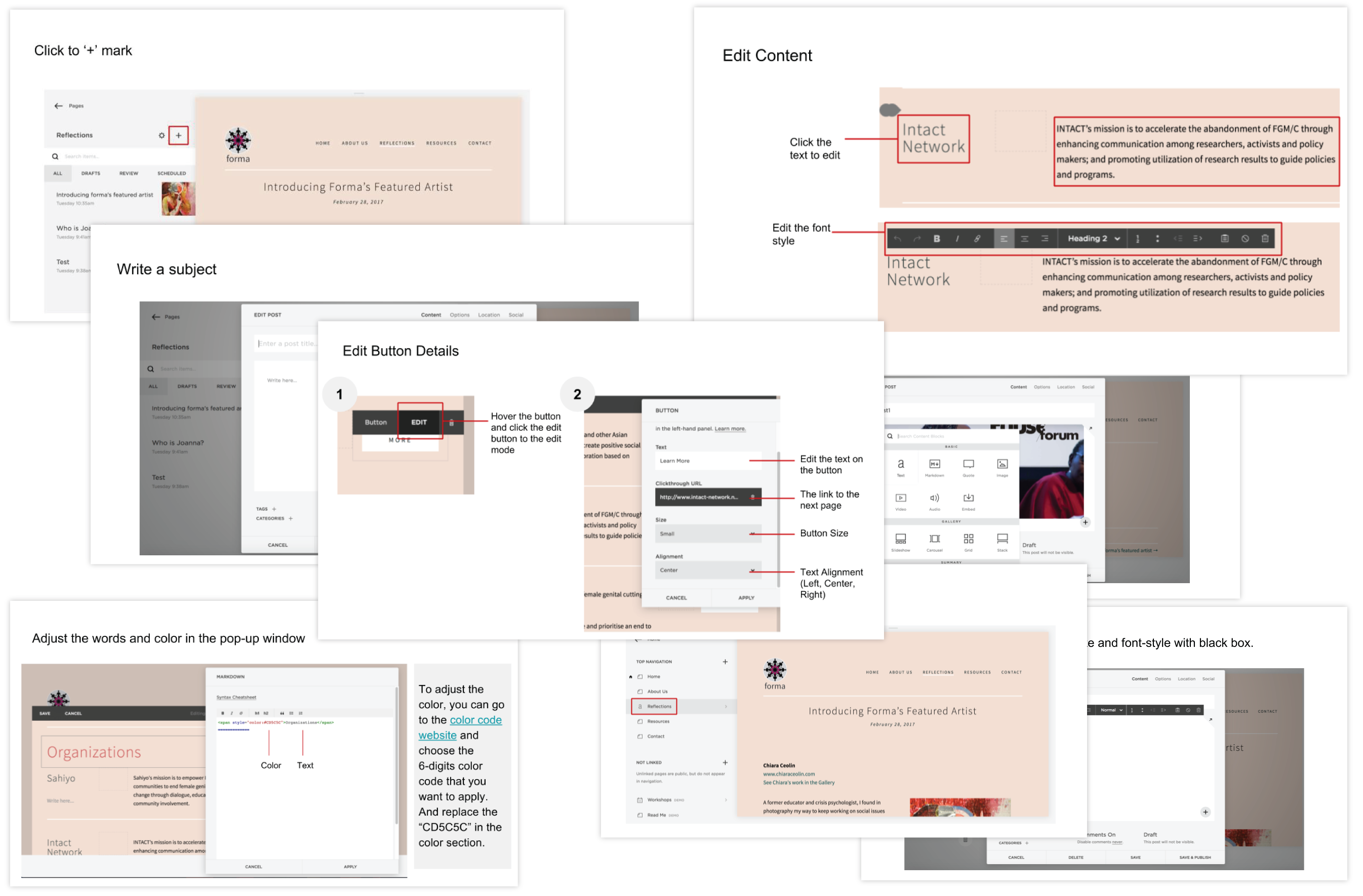
Guideline documentation for the client
IMPACT
• forma can reach out to digital generation with new designed website.
• Users can navigate website easily because information architecture became more intuitive.
• Compare to old website, new website also considers users who does not have knowledge about FGM/C, so forma website became more informative space to everyone.
• Forma’s new website is expected to be a more interactive space. SNS feed and blogging features are imported to the new website, so people can share information quickly and can interact with other users on the homepage.
• Forma’s new website can be kept up to date more frequently because our client, the Executive Director of forma, can manage homepage by using the website builder (Squarespace).