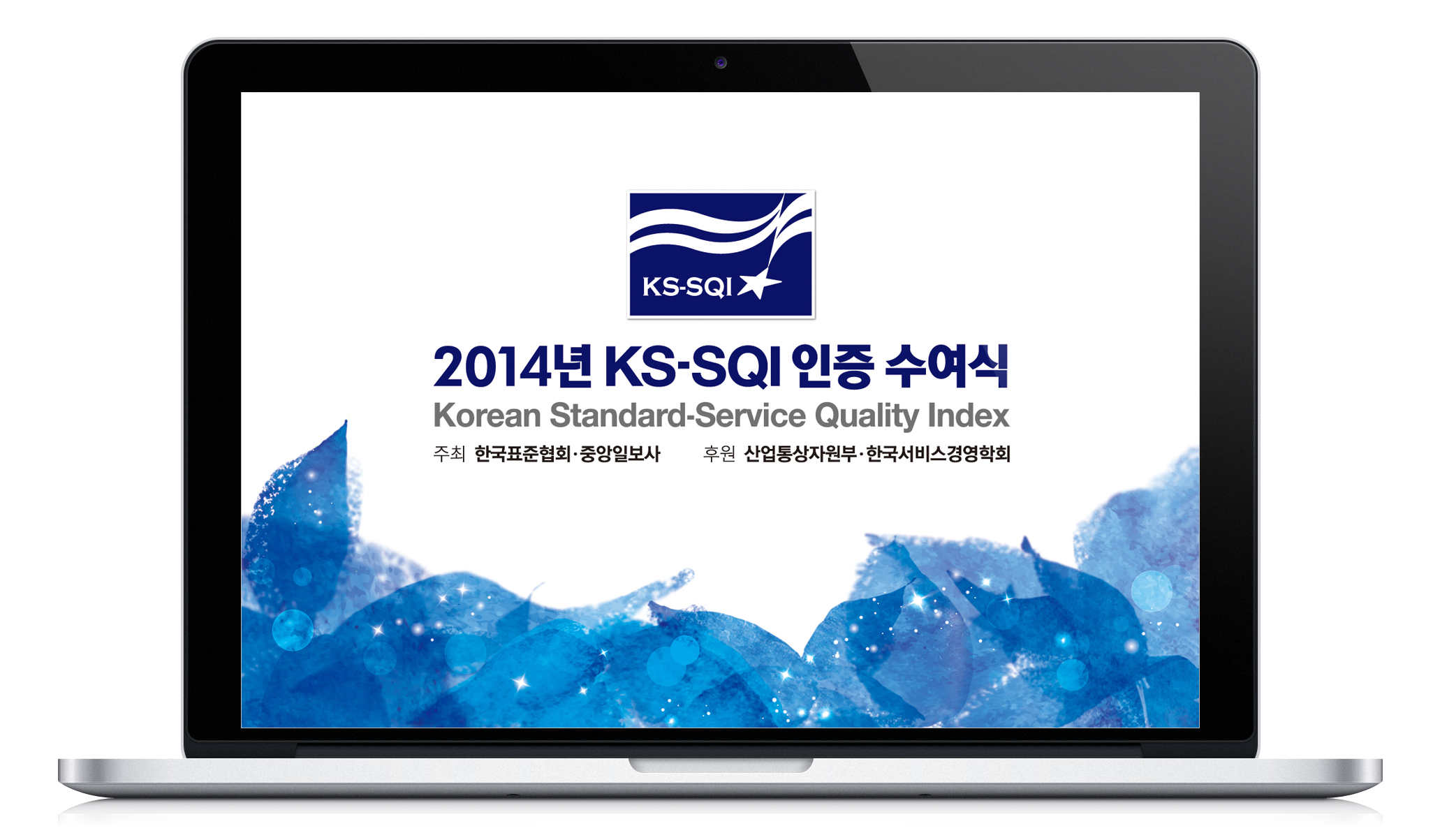
KS-SQI OVERVIEW
KS-SQI is an economic indicator that measures service quality and customer satisfaction of service companies. It was developed through the partnership of the Korean Standards Association, and the Institute of Operations Management at Seoul National University. KS-SQI has been conducted every year since 2000, with the goal of strengthening the competitiveness of the service industry, and improving customers‘ quality of life. The Korean Standard-Service Quality Index (KS-SQI) is one of the most authoritative indices for customer satisfaction in Korea, along with NCSI and KCSI. The organizations announce evaluation results annually, and this project is a brand design for the 2014 KS-SQI announcement (an advertisement and ceremony event).
DESIGN PROCESS
01. Comparaitve Analysis
At first, I briefly analyzed the present situation of KS-SQI, compared with other competitive indices. The brand design identity is relatively low. For example, customers are familiar with NCSI, because of its coherent simple design works. (e.g., logo, advertisement, report covers)
02. Design Concept
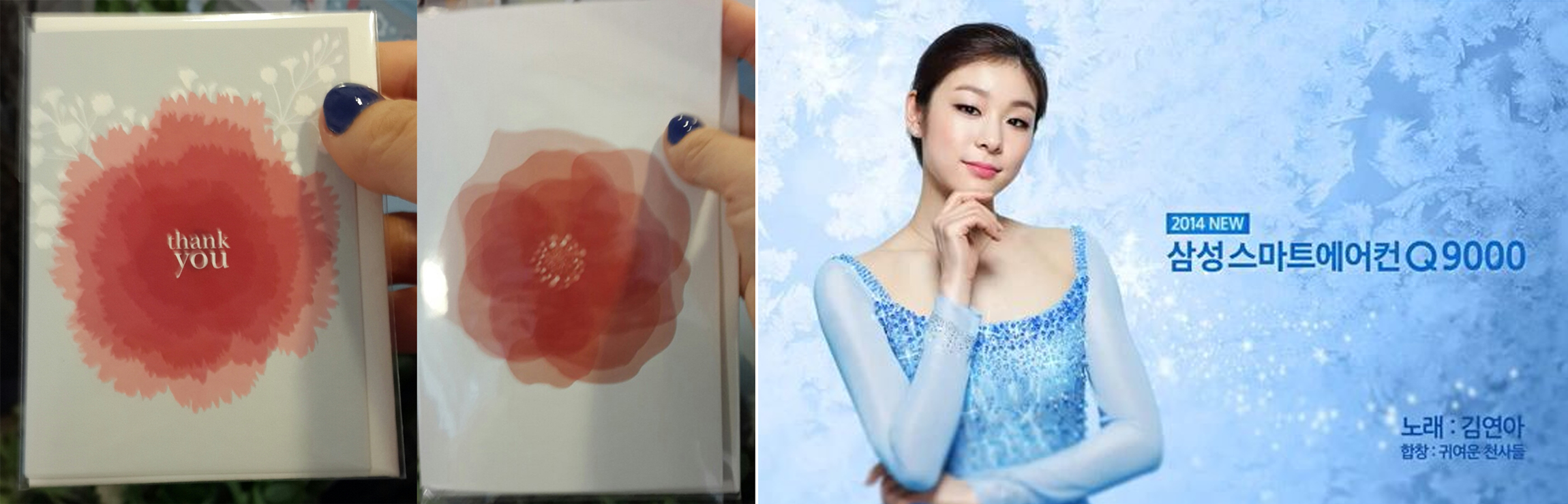
Our team wanted to deliver 'emotional' and 'thankful' feeling through the advertisement. In order to express these feelings, my team decided to write ‘당신 참 좋다’ for the main copy. It means, “You are very good (nice),” in English. This copy has more than one, ambiguous meaning. While one meaning relates that the rated companies have a high-quality service level, the other one says that those highest-rated companies - highest in terms of service quality - demonstrate genuine appreciation for their customers; it is, after all, their customers who rank those companies as the top in their field or industry. In short, both consumers and companies say “You are very good” to each other.
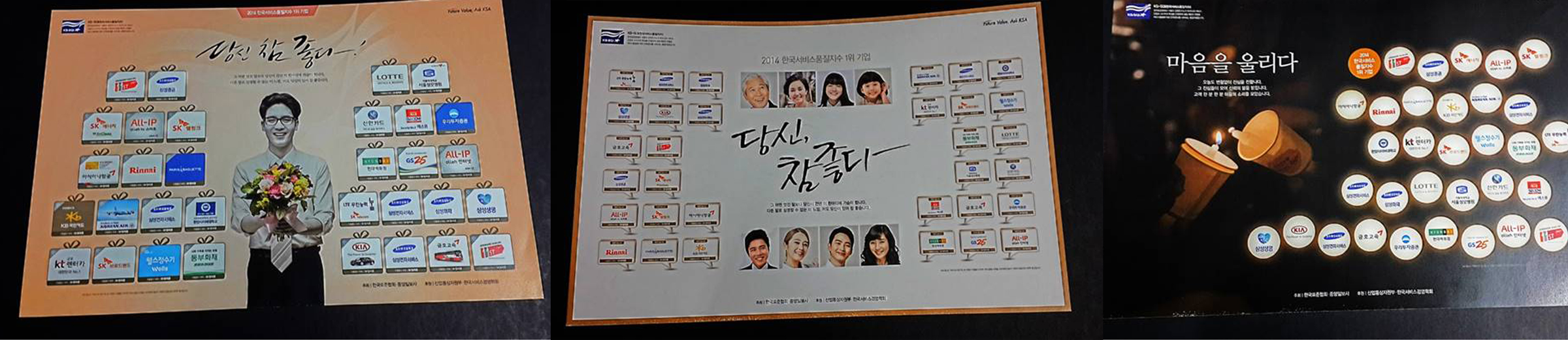
03. Visual Design for Advertisement
Several advertisement designs for newspapers were proposed by a designer, but the proposal could not reflect our brand Identity, so I gave the designers direction on how to change their concept. I had been inspired by "Thank You" cards, and Yuna Kim’s advertisement design. In order to achieve our project goal, I decided to use the image of a carnation. In addition, I decided to emphasize the color blue, since the KS-SQI logo is the color navy (Also, in Korea, carnations imply gratitude).
Choosing passenger based on ride requests information
Choosing passenger based on ride requests information
Choosing passenger based on ride requests information
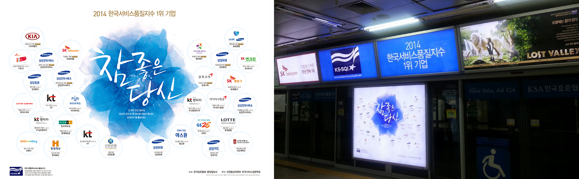
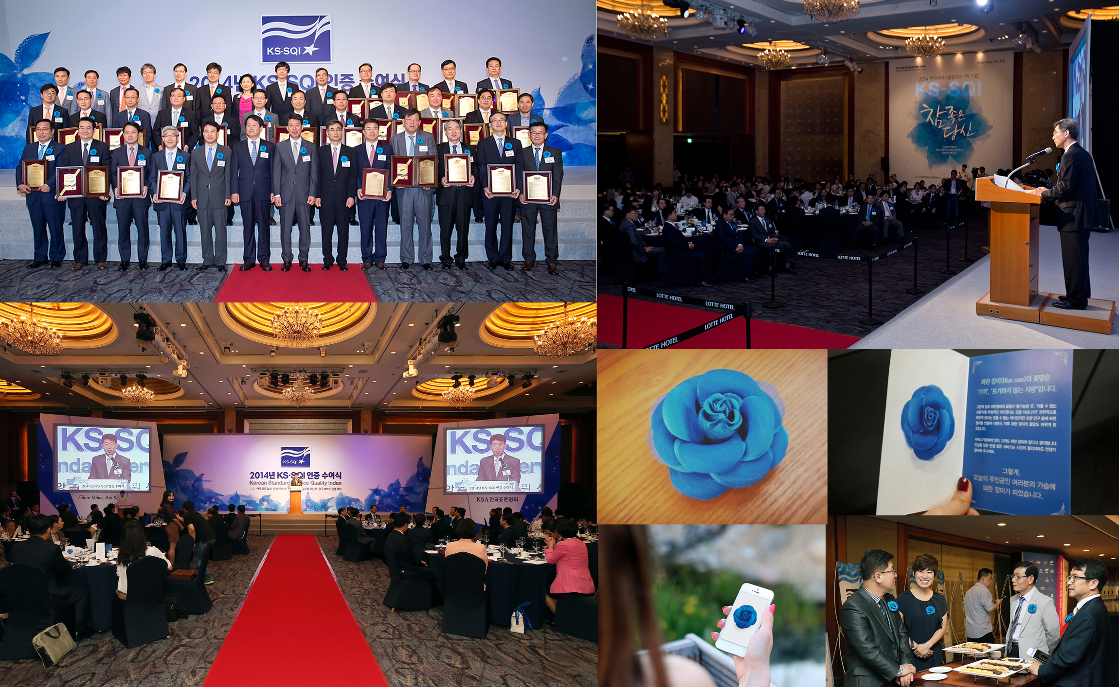
04. Main Pattern Design for the Ceremony
When the KS-SQI results and top-rated companies are announced, a ceremony is held for the companies rated No. 1 Companies in their industries for that year. VIPs (most of them are CEOs at their respective companies), as well as customer satisfaction and/or marketing-related company team members, are both invited to the ceremony.
In order to deliver a consistent brand design, I pushed the event company partner to use a blue flower image as part of the advertisement design.
Choosing passenger based on ride requests information
Choosing passenger based on ride requests information
05. Ceremony Event Experience Design
I wanted to make the ceremony experience memorable and special. While previous events had focused on only the CEOs of the top-rated companies, I wanted to make all visitors - both CEOs, and their employees - feel special by delivering the message, "Thanks to your endeavors, your customers are very satisfied with your service." To deliver this message, a blue flower corsage was provided to every attendee. There were also paper cards, and mobile cards, which explained the meaning of the blue flower.
Choosing passenger based on ride requests information
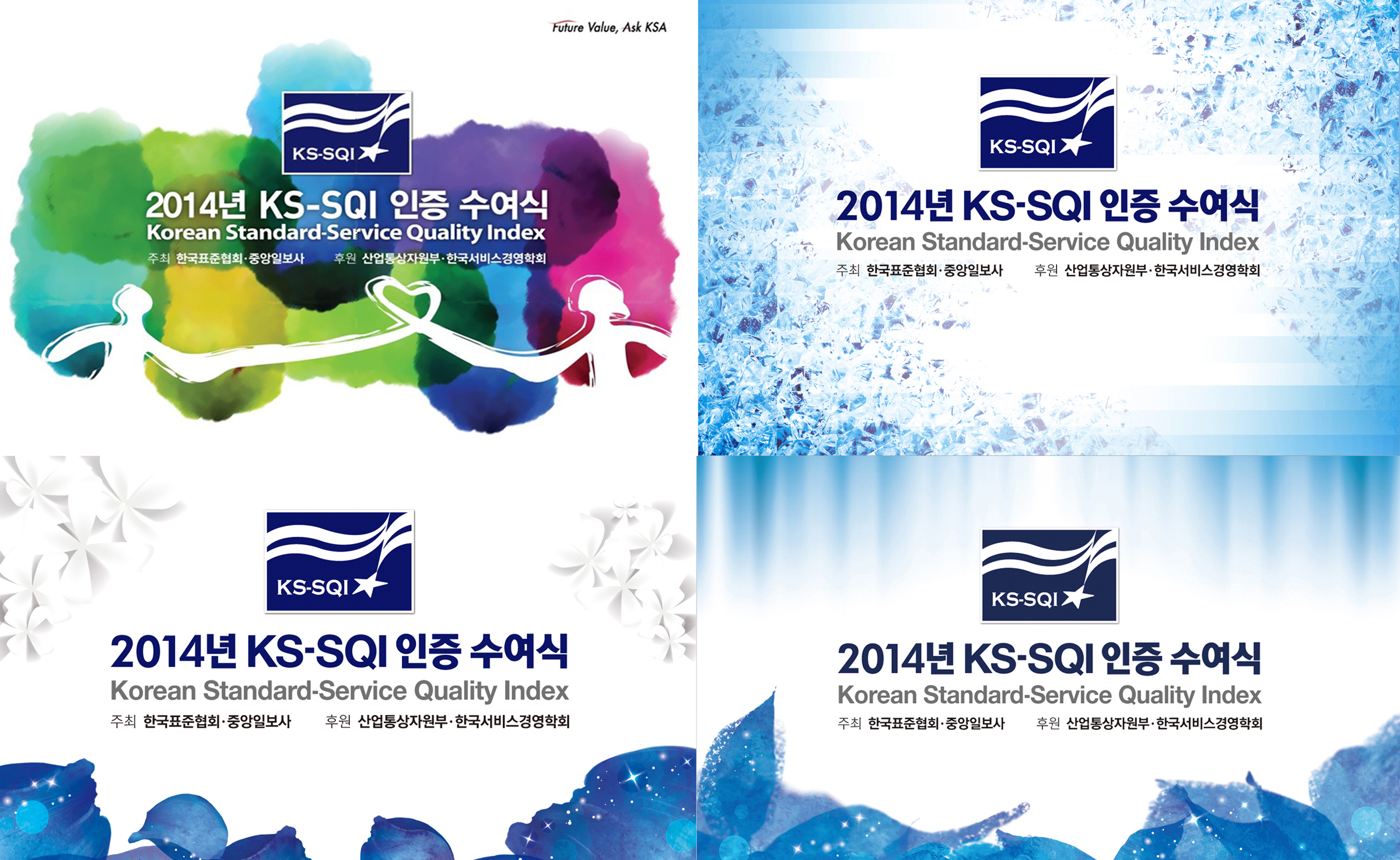
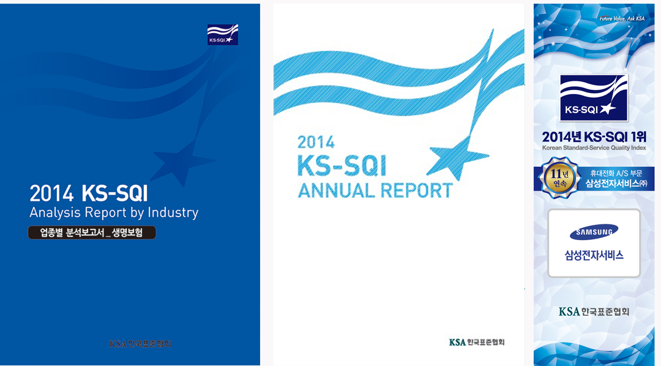
06. Design for other materials
The same design concept was reflected on other materials (such as report covers, x-banner, and so on). The logo image, and blue color, was emphasized on the materials to increase brand identity and recognition.
Choosing passenger based on ride requests information